Libby
Our team was tasked to create a new feature for an app of our choice. We chose Libby, an award-winning app that allows users to borrow books from their local library through their library card.
We designed a social networking feature that would allow users to interact with one another, rate and review books, and join an online community of fellow readers.
Project Scope
Mobile app project
Timeframe: 3 week sprint
Role: Researcher, Designer
Team: Potoula Anagnostakos with two other designers
Methods: Generative Research, Data Synthesis, Journey Map, Personas, Evaluative Research
Tools: Figma, Trello, Google Workspace
Deliverables:
User interviews and insights
Competitive analysis
User personas, flows, journeys
Mid-fidelity and interactive high-fidelity prototypes
Usability tests and insights

Problem Users want to way to connect with fellow readers to share, discuss, and recommend books to each other.
Generative Research
& Data Analysis
When we chose to design a social networking feature for Libby, we wanted to understand who we were designing this for and why. We recruited users for a round of interviews and thought about what would be most important to ask them.
To prepare for our interviews, we created an interview guide to get to know our readers, understand their reading habits, the way they discovered new books and authors, decided on what to read, interacted with social media, and how they felt about sharing their reading preferences through a social networking platform.
After we conducted 12 interviews, we gathered insights from their perspectives through affinity mapping. Some examples included:
“People with similar tastes can come together.”, “It could jumpstart a community feel.”, and “I would like to join book clubs and meet new people on such a networking feature and see other peoples’ opinions.”.
Essentially, readers want to be part of a community, want to seek and provide recommendations, and customize their experience to fit their needs.


Further Analysis
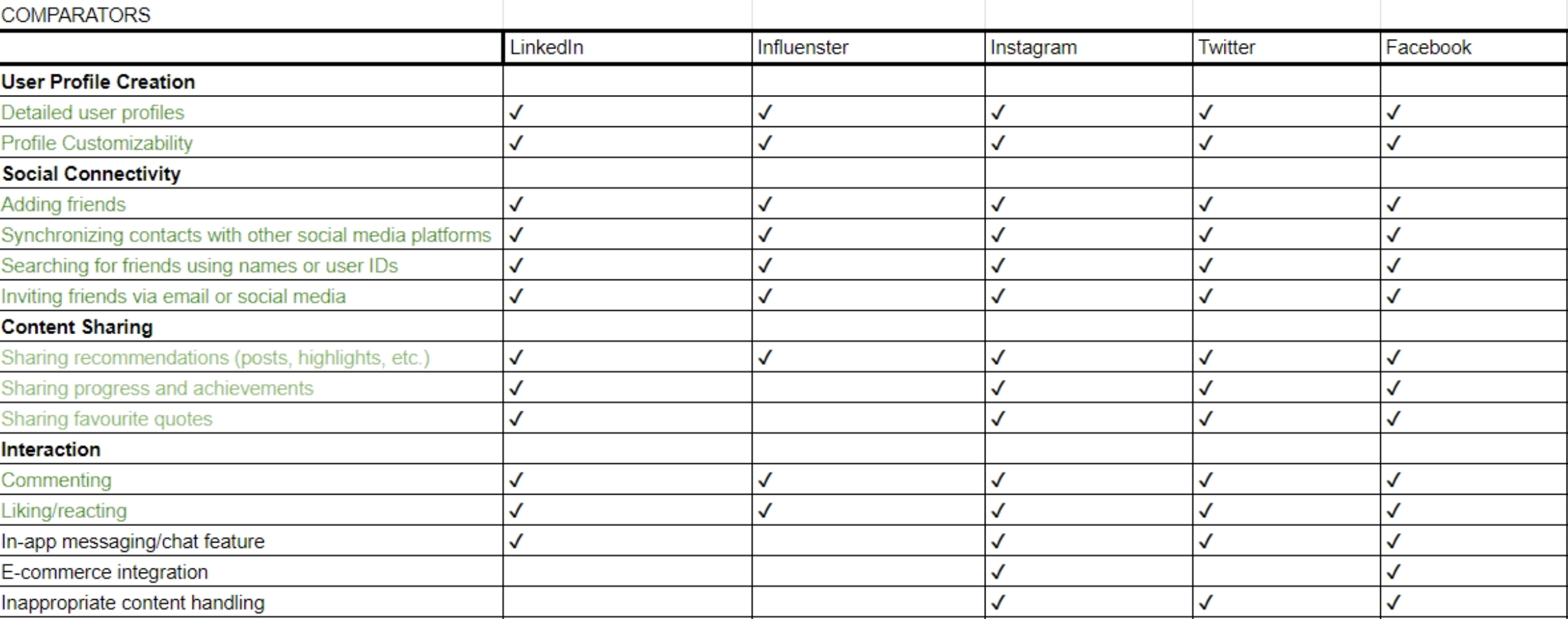
We ran a competitive analysis to understand to understand how this new feature and Libby stand out in the market. Out of eight competitors and eight comparators, we chose to concentrate our focus on the ones we found most inspiring for our problem at hand. We also noticed that most of our competitors had close to none of the social features we were looking to build out.
Some features we took inspiration from were LinkedIn’s feed, where users can easily create, interact, and share posts with followers, GoodReads’ ratings and review screen, as well as Basmo’s onboarding process.
Defined Personas, Their Journeys and Flows
We used our insights gathered from our users to create personas that embodied our users’ behaviors, goals, pain points, and motivations. This helped us keep our users at the core of our design. Our primary persona sought a platform where they could join an online community of fellow readers where she could easily find book recommendations. Our secondary persona shopped mostly online because of its convenience and wanted assistance in purchasing the right product.
From our insights, we also created customer journey maps that helped frame our users’ pain points and goals into an end to end process, to understand their steps that they may take to lead them wanting to use Libby’s social networking feature. This helped us identify our How Might We (HMW) statements:
…design different features to cater to varying levels of community involvement?
…challenge the assumption that all users want a public feed and explore more private sharing options?

In understanding our users’ personas, journey, motivations, and pain points, we then created a flow in which they would leave a review. We needed to design this process in a way that would encourage our users to express themselves and interact with the platform and other readers.

From Sketches to Wireframes
We began with sketches to figure out how best to create an easy way for readers to rate and review books that they read and share it with their followers. From our sketches, we created grey scale wireframes and proceeded to build out our first version of our prototype. We designed the screen and actions to be familiar to the user, as if they were to leave a review on other apps or websites. Readers can leave a 1 to 5 star rating and include a description of their opinion, which were components carried over from the design studio to the next iterations.
Evaluative Research
Once we had our first iteration of our screens, we conducted usability tests to understand if we were on the right track. Some improvements were made based on feedback we received from our users.
"Actions" button: users didn't know to scroll down to find the "Leave a Review" button and we noticed that some participants tried clicking on the "Actions" button so we added "Leave a Review" to a drop down menu under "Actions".
"Upload Media"option: users didn't know to click on the "Upload Media" text and some that they needed to upload media rather than seeing as an optional action. We added a separate pop-up window if users wanted to upload a photo and a way to exit of the window should they choose not to upload media.
Differentiation of Reviews and Posts: users could not tell the difference between reviews and other types of posts on the feed. The ratings set apart the reviews from other posts. We solved for this by creating a distinct format for reviews with the star ratings and text highlighted. Users could also click on the attached media to enlarge it to see it more clearly.


Final Product
Once those improvements were made, it was time to update our prototype. This allowed for us to design a more complete, user-focused, and efficient feature for readers to enjoy. In this iteration, users could easily rate a book they’ve read, leave a descriptive review, attach photos, and share it with their followers.
Insights:
After we delivered our prototype, we revisited our user research deliverables as a group. We discussed the various edge cases we came across while conducting user interviews and making our affinity mapping classifications, which included the following:
Anonymous user profiles: Design a version where privacy is the top priority, even to the extent of anonymity in discussions and ratings
Remove ratings and reviews: Consider a system that doesn't rely on traditional ratings and reviews, but still informs readers about the quality of books.
Edit and delete posts, leave group flow: Explore the user flows to editing and deleting posts. What would be the user's process to leave a group?