MonsterNums
The mission of MonsterNums is to provide an online learning platform that caters to the unique needs of neurodivergent tweens with AD/HD, as well as those who struggle with traditional forms of math education. Our goal was to empower our users by allowing them to customize their learning experience to fit their specific needs and preferences.
Project Scope
Client project via TechFleet
Timeframe: 10 week sprint
Role: UX Writer, Content Designer
Team: Potoula Anagnostakos with six other writers
Methods: Generative Research, Data Synthesis, Journey Map, Personas, Tone Map, User Stories, Brand Narrative, Evaluative Research
Tools: Figma, Notion, Google Workspace
Deliverables:
Brand narrative (voice, tone, content)
Low and mid-fidelity wireframes
Product vision statement and feature specifications
Hand-off document with content recommendations and guidelines to provide to the client and product teams involved in the app’s future phases
User flows, stories, personas, journeys
Research plan
Competitive analysis, surveys, usability study

Problem Children with ADHD and other learning difficulties need to a way to learn math that is accustomed to their learning needs and preferences.
As the UX Writing team, our objectives were to:
Personify the app’s voice and purpose into a helpful, friendly buddy that guides users through the app and helps them on their math learning journey.
Decide on a new app name that is more in line with the character & tone in our Content Guidelines and is also not copyrighted.
Give the app a consistent voice and tone to guide further development of content.
Generative Research
I joined the project during its second phase and it was clear that in its early stage, it was crucial to not only understand our users’ needs but ensure that the app’s tone, voice, and use of language properly suited their age range.
We conducted a competitive analysis of similar math and learning apps to understand their voice, flow, and if they offered customization. We focused on these features to help us fully flesh out our own app’s voice and language flow. Customizable settings, like bionic font and high contrast, would be imperative to include in our app so users could truly make their learning experiences their own and learn in a way that best suits them.
Then, we gleaned insights through conversation mining from these apps’ reviews to better understand our target users’ needs, pain points, what worked for them, and opportunities for improvements. Concerns such as having an app that’s too text heavy, not equipped to properly teach students of varying skill levels, and lack of context caught our eye.
What we learned was that education was just as important as engagement, to ensure users were learning and felt motivated and excited to continue learning through the app.


In keeping these concerns in mind, we began to tackle the onboarding process. We reviewed the copy that was provided to us from the design team and proceeded to revise each prompt. Kicking off the onboarding process, the user needed to feel welcomed to the app. We needed to make sure the language was easy to understand, concise, and immediately informed the user of what call to actions needed to be taken.
We started at the beginning of our onboarding process, with the math buddy introducing itself. It was important that its role in the app was to be a trusted guide and tutor. It’s there to lead users through the app and its lessons.
In this early iteration of the onboarding process, the sentences were longer and the language was formal and less kid friendly. We needed to write copy that was concise, easy for children to understand, and ultimately get excited them to move onto the next step.
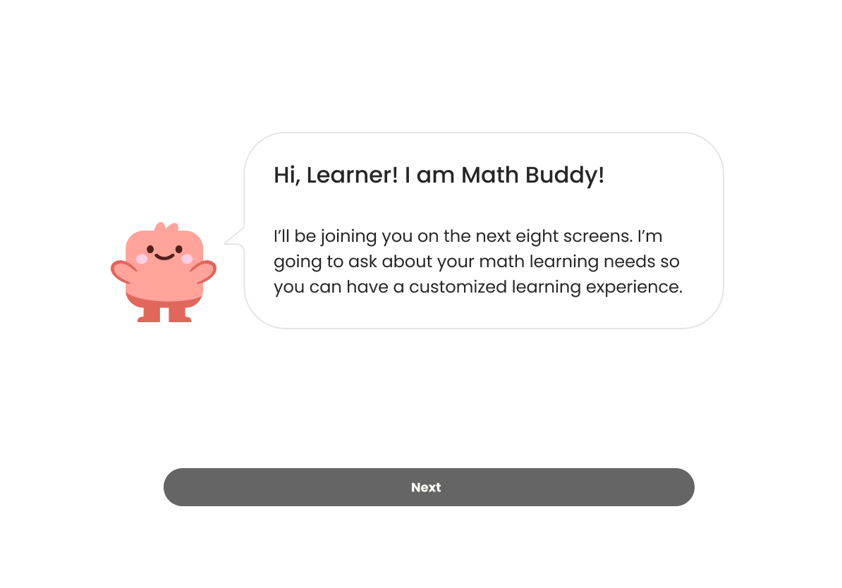
Following our revision, the language was engaging, approachable, clear, and concise. With longer sentences, we lose our audience’s attention. We need to keep it for the duration of the onboarding process.

Once the math buddy’s introduction was solidified, we focused on questions around which math topics users struggled with. The challenge here was how best could we encourage our users to answer these questions without potentially feeling flustered. This goes back to our goal of creating a friendly and motivating voice and tone, so it was crucial that we did just that and empowered our users to help the app know what their math strengths were and where they needed more guidance.
In this early version, we asked users to select which math topics they covered recently and which ones are the strongest. We wanted to simplify the language here as well as reduce the number of questions asked in the onboarding process.


We combined these two questions because they essentially ask the same thing. Phrasing it in this way makes the user feel at ease if they don’t have a strong math subject.

As the user continued, they’re given the option to further customize their learning experience. They are able to change the display and appearance of the app itself at that moment or can do so whenever they’d like.

Should they choose to proceed, the user can change the level of contrast, the font type, and can view an example question so they know what to expect. Different font weights, color-coding, visual hierarchy, or grids can help the learner focus and prioritize the targeted content.

Default Font Selected

Medium Font Selected

Bionic Font Selected

Square Grid Selected

High Contrast Selected
Once we established the app’s tone and language, we needed to find the right name for the app, something that would set it apart from competitors in the market as well as have a strong identity that resonated with our target audience.
We guerrilla tested potential names with children that were part of our target audience (ages 8-11). They voted for MonsterNums, a combination of our mascot and numbers.
To further solidify the app’s identity, we created a glossary of terms that are specific to the users’ needs, platform features, and could be shared with both internal and external shareholders. This was also included in our hand off documentation and content guidelines.

Insights:
As the app’s second phase closed out and our participation on the UX Writing team came to an end, we set out and accomplished what was needed. We stood by our goals and our principles, which were to:
Educate - Teach learners what they are learning in school in a way that makes sense to them and at their own pace.
Empower - Enable learners with disabilities to engage in math with confidence through strong support and encouragement.
Respect - Treat learners with respect and communicate in a way that is considerate and inclusive.